Design 101 - How to Create a Color Scheme Like a Pro
by Grace MacDonald
When it comes to selecting a color scheme for a room, a floor or even a whole house, it’s easy to become overwhelmed by the amount of choice out there.
In this post, I’ll break down my 3-step process to help you choose your next color palette just like a pro.

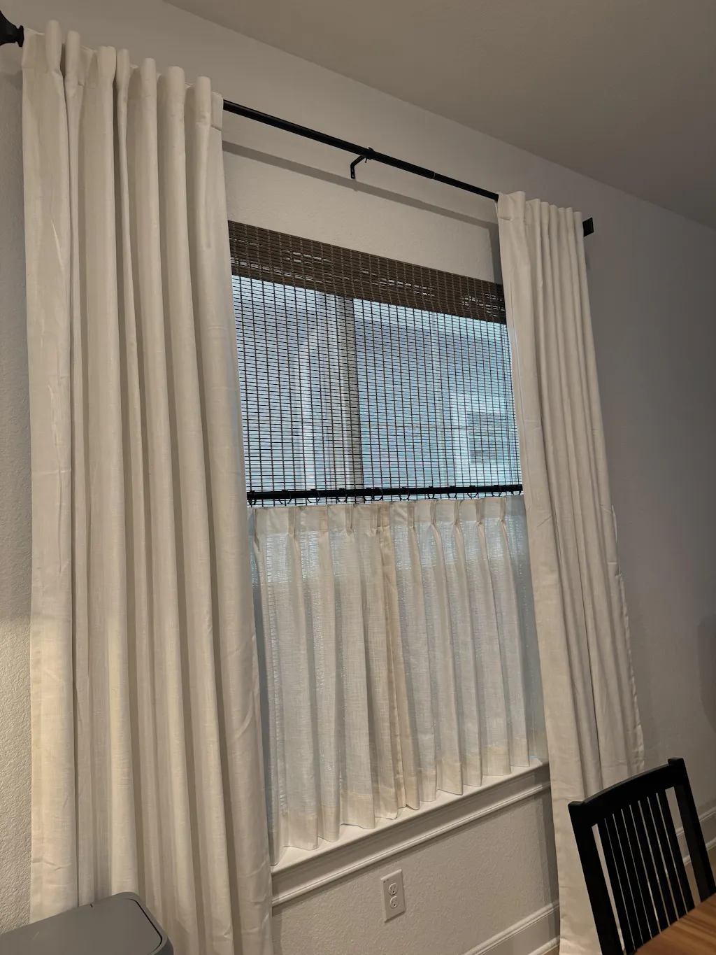
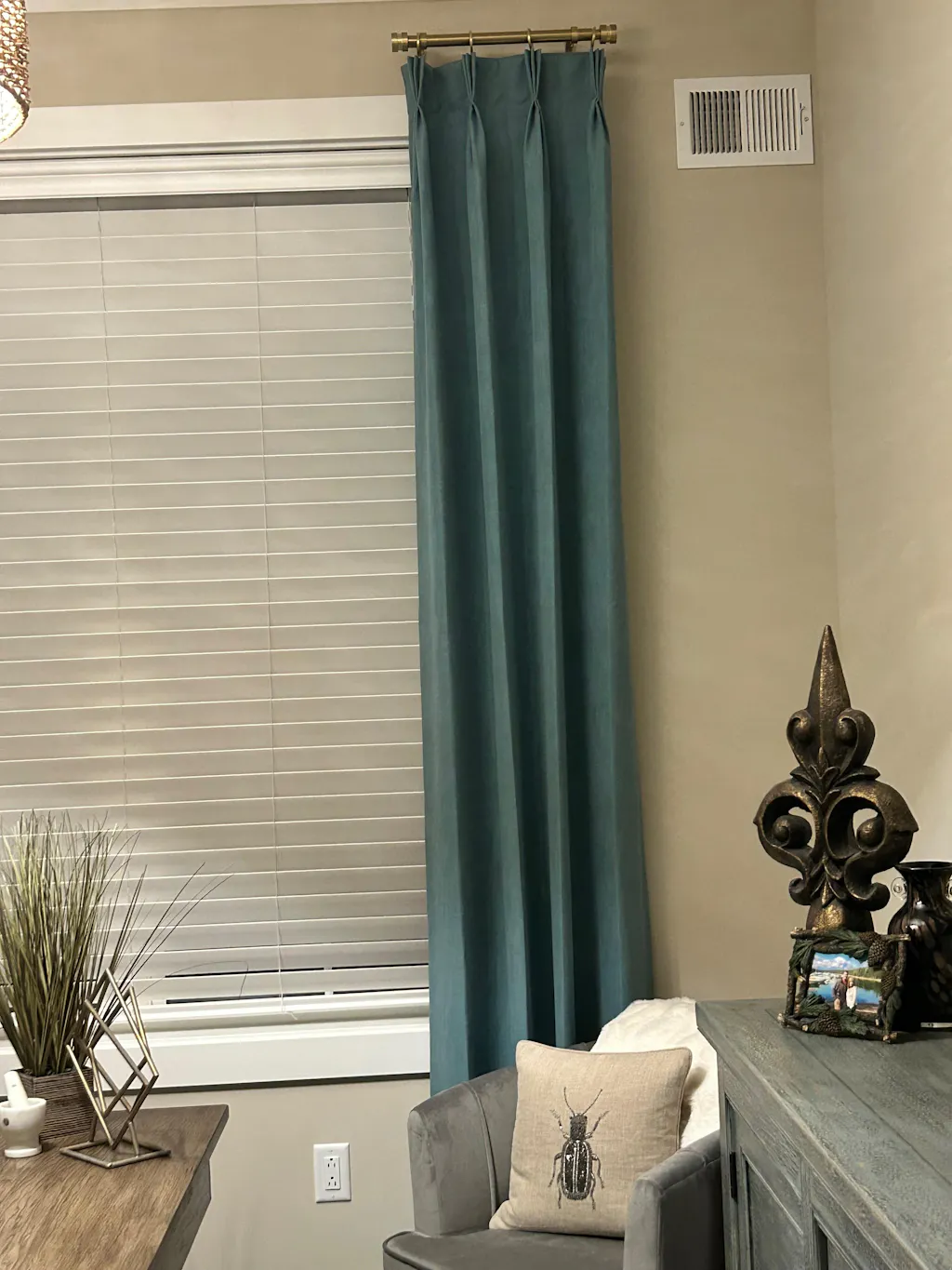
Pictured: Sara Le Print Linen Drapery Pleated
Step 1: Define How You Want Your Space to Feel
I always like to begin by asking my clients how they want to feel in space. Do they want to feel cozy and relaxed, or maybe energized and focused? I find this gives great insight as to where to start, but I also ask them to consider which colors they’re naturally drawn to. There’s a lot of psychology beyond color, and different colors are known for evoking different emotions. A helpful (but certainly not comprehensive) summary of these are:
Blue – calmness, tranquility
Green – nature, freshness, harmony
Purple – luxury, regal, creativity
Yellow – cheerfulness, sunshine, optimism
Orange – positivity, happiness, warmth
Red – love, passion, energy
White – purity, cleanness, lightness
Black – power, boldness, sophistication
Brown – stability, earthiness, comfortability

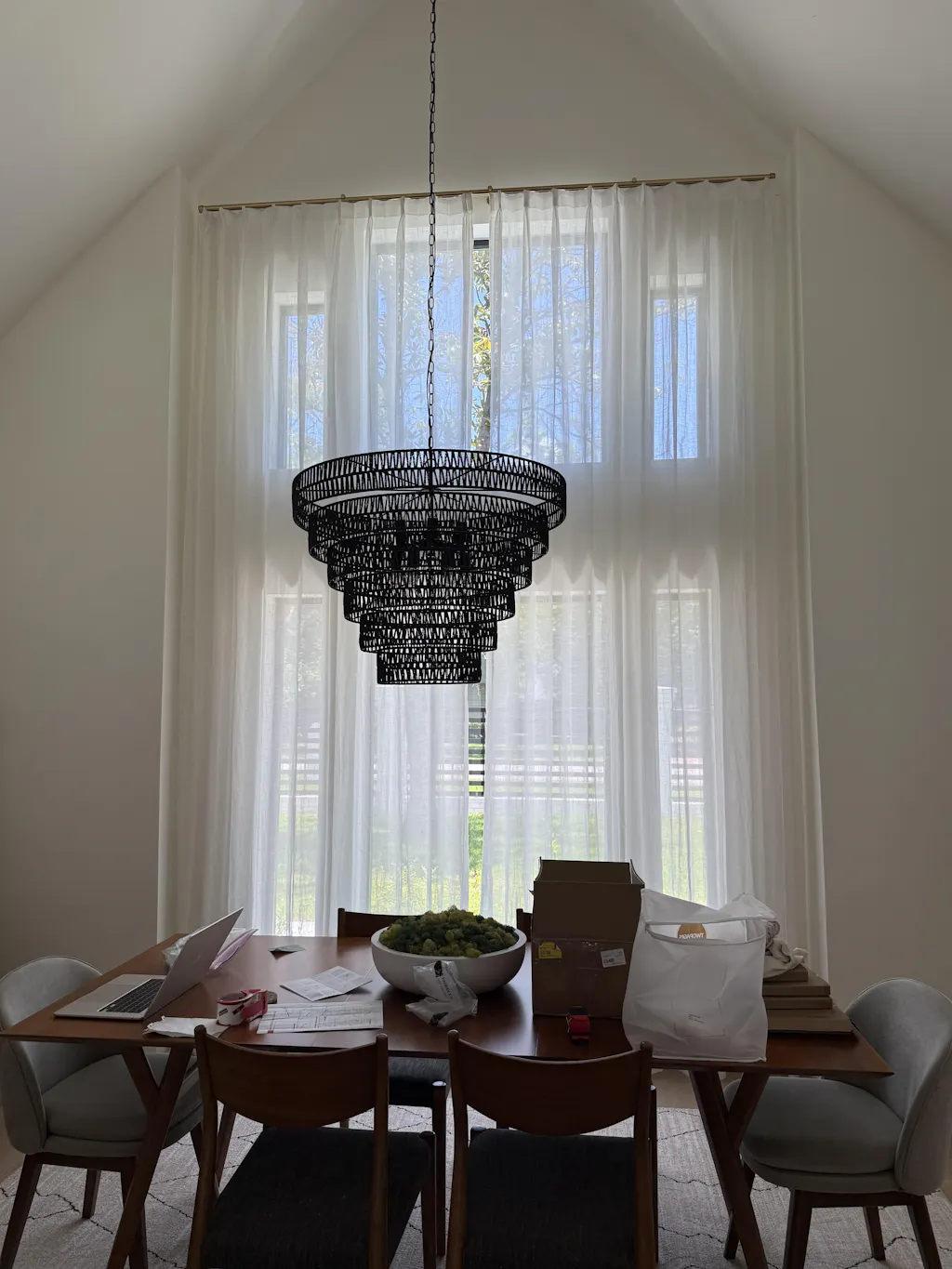
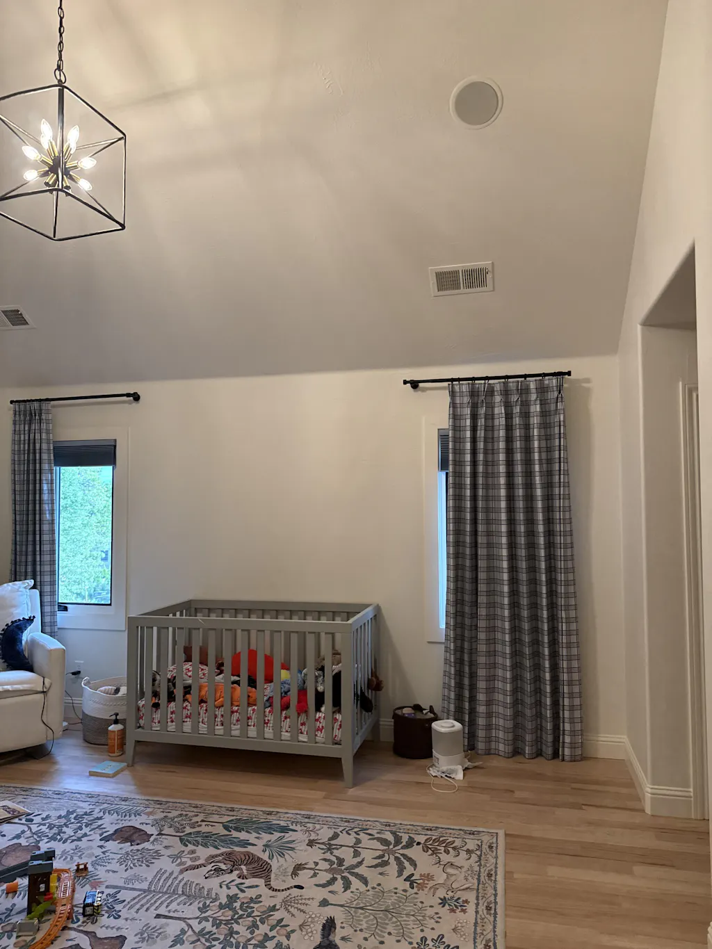
Pictured: Jawara Linen Cotton Roman Shade Cordless
Step 2: Master the Color Wheel to Choose Harmonious Combinations
Next, it’s important to consider the color wheel, and select a color scheme that incorporates your colors from step 1. For example, an Analogous color scheme usually involves 2-3 colors that are right next to each other on the color wheel and is historically a great place to start if you are new to working with color systems.

Complimentary color schemes involve 2 colors that are opposite each other on the color wheel, such as red/green, blue/orange or yellow/purple. While these are probably the most recognizable color combinations, when paired together in their purest forms they tend to create very jarring contrasts, which is why I always recommend incorporating tones/shades of these colors when pairing together – such as a deep navy blue with a rust-colored orange.
There are plenty of other color schemes to out there such as a triad, split complimentary or even a tetrad, if you want to get really fancy. Some designers even implore the ‘colors of nature theory’, which states that colors that are naturally found together in nature, naturally go together.

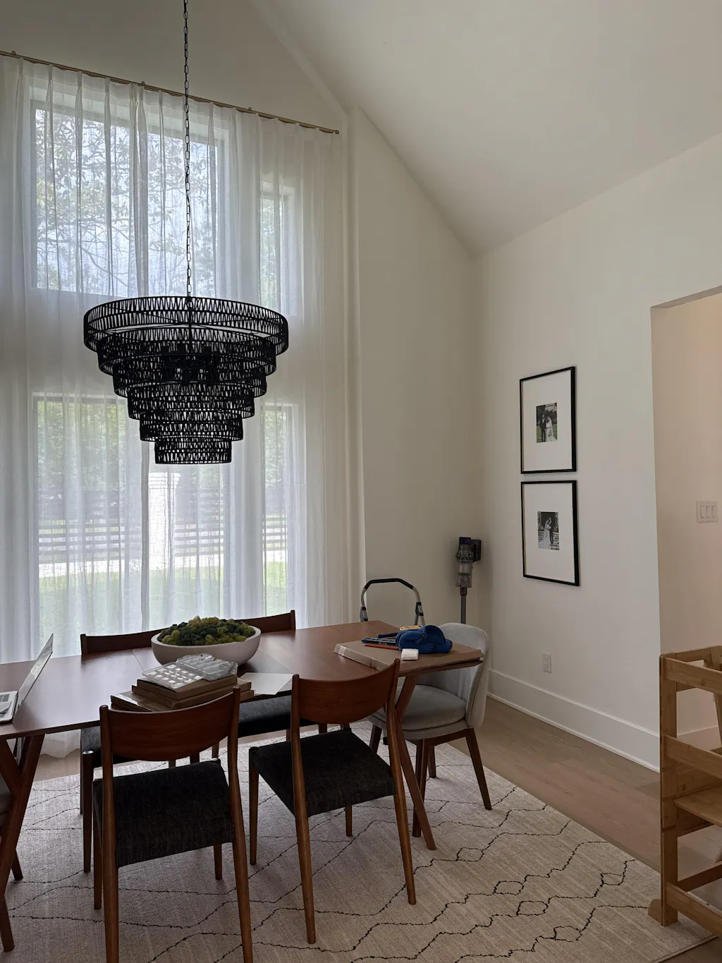
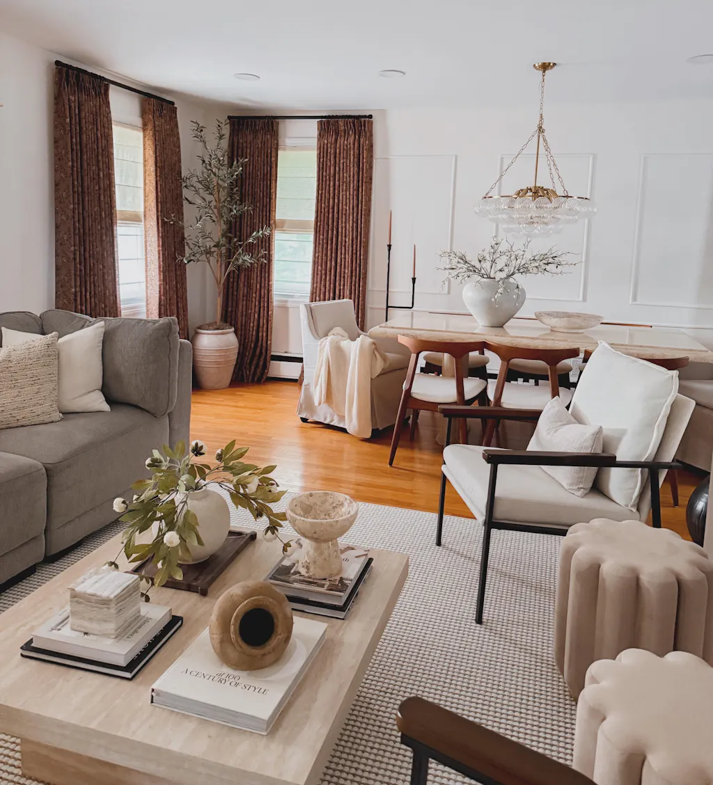
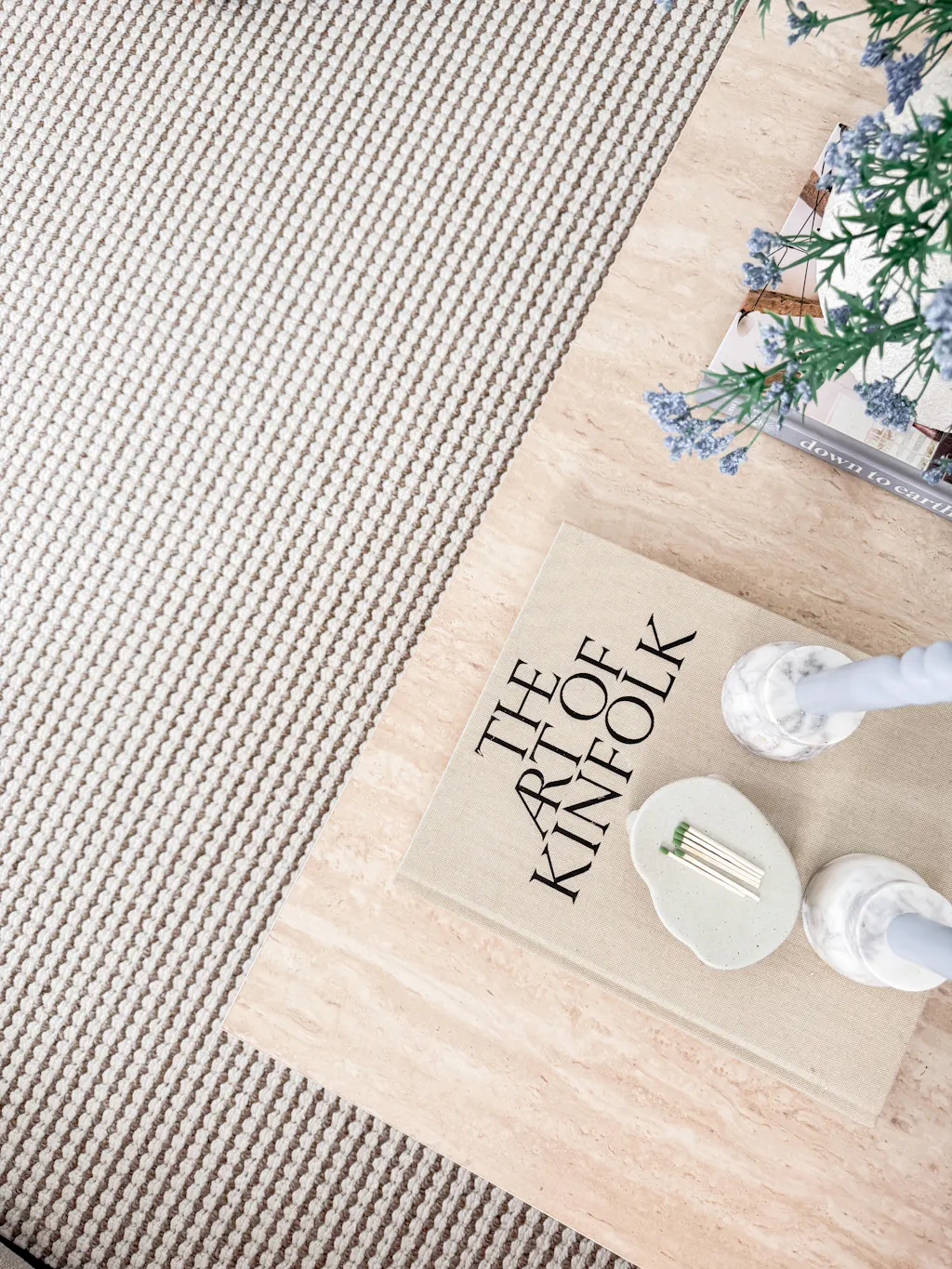
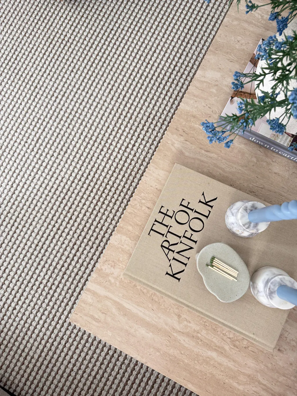
Pictured: Birkin Velvet Curtain Pleated
Step 3: Apply the 60/30/10 Rule to Build a Balanced Palette
Once you’ve honed in on your key (2-3) colors, that final step is to build your palette using the 60/30/10 rule. This rule states that:
-
60% of the space will be one or two main colors
-
30% of the space will be a few accent colors (not contrasting colors)
-
10% of the space will be 1-2 contrasting colors, just something to add a little visual interest here & there
-
B/W – a few B/W elements are also often helpful to add to a space to bring the chosen colors to life
When I think I have my palette, I love to grab a few color chips to visualize all the colors together in the space!
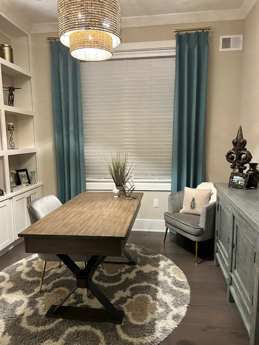
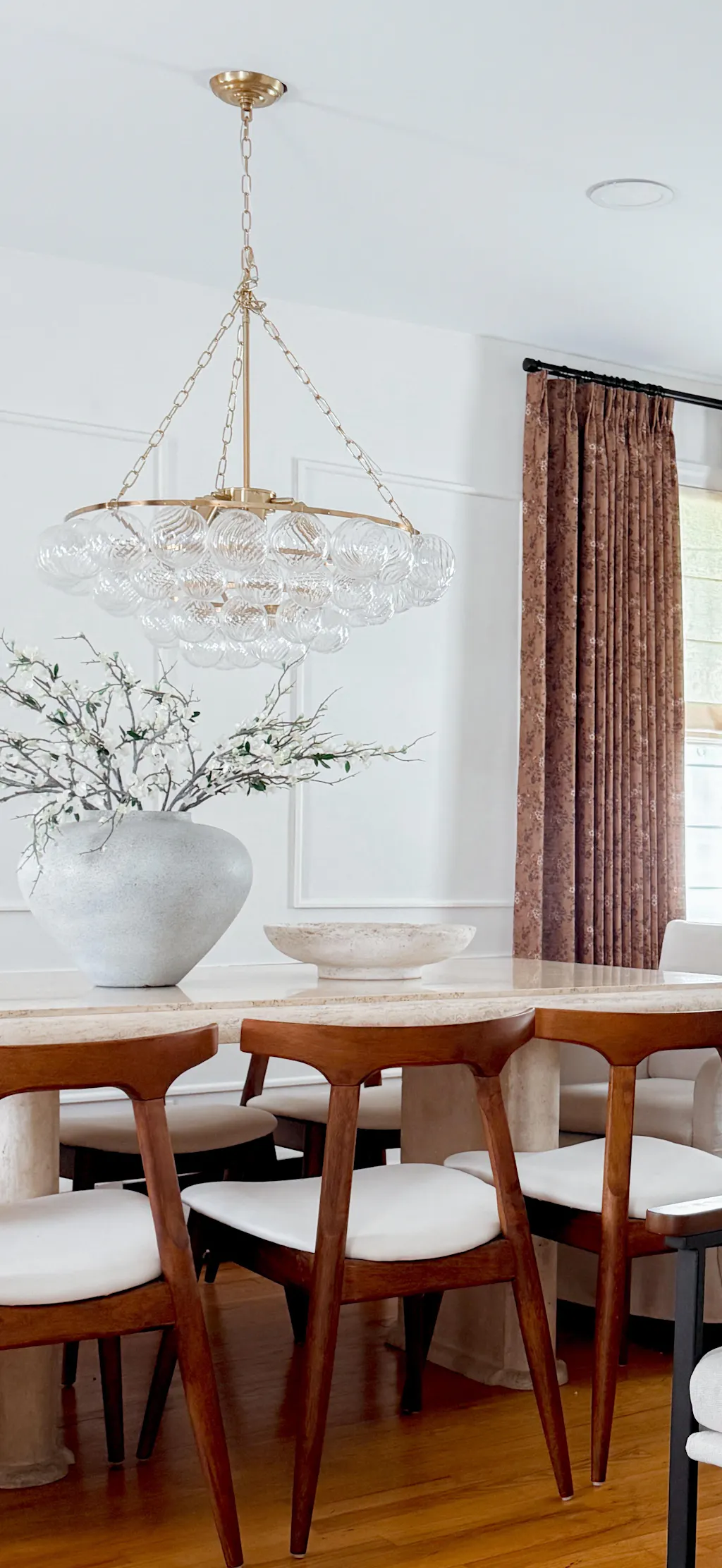
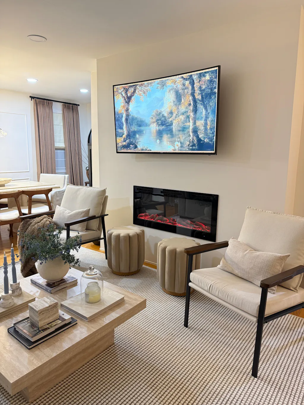
When it comes to window treatments in the rooms that I design, they are often part of that 30% category, an accent color that compliments the primary color of the room, as with this office or living room.


However, in rooms that are very ‘color-drenched’ with only 1-2 bold colors, I tend to incorporate the choice of window treatments into that 60% as one of the two main colors, as in this very moody living room.

Ultimately, your choice of color scheme for your own spaces is a very personal decision, and I encourage you to always select colors that you love, but if you’re stuck, I hope my process can serve as a helpful guide for steering you in the best direction!
ABOUT WRITER


Leave a comment