The Rise and Fall of the Neutral
By Brittany McNab
We’ve likely all noticed a shift in the atmosphere of design as of late—the neutral is dying, and in its place, we are seeing colour, pattern, and an overall boldness that feels fresh and exciting. Beige and grey have now become the butt of all interior design jokes, citing “sad beige” and “millennial grey” as tired and overproduced fast-tracks straight to design jail. But what’s the deal? And why have we suddenly become so impassioned about beige and grey? More importantly, how can our own interior choices reflect this change in popular styles? The answer is a long and winding journey, with the destination being an all-important and much-needed “return to self.”

The Rise of “Calm, Simple, and Clean”
Let me take you all the way back to 2014—we were fresh off a wave of yellow and teal ikat and chevron patterns dominating our interiors. The real ones remember seeing these styles pop up on blogs and then—suddenly, as if overnight—farmhouse and modern farmhouse took over the blogosphere, Pinterest, Instagram, and slowly but surely, our own homes.
The appeal was simple and understandable—pared-down, simple interiors = calm. As chaotic as the world has been thus far in our young lives, the quest for calm is understandable. We came from the cluttered and busy homes of the ’90s and 2000s—filled with Tuscan kitchens, sponge painting, and Aztec wallpaper borders. Whatever it was that felt chaotic about that time, the farmhouse aesthetic—with its white, grey, and black paired with cool barnwood tones—seemed to be the complete opposite, and it was welcomed. Something about cosplaying humble farmfolk tending to a simple farmhouse felt tranquil.
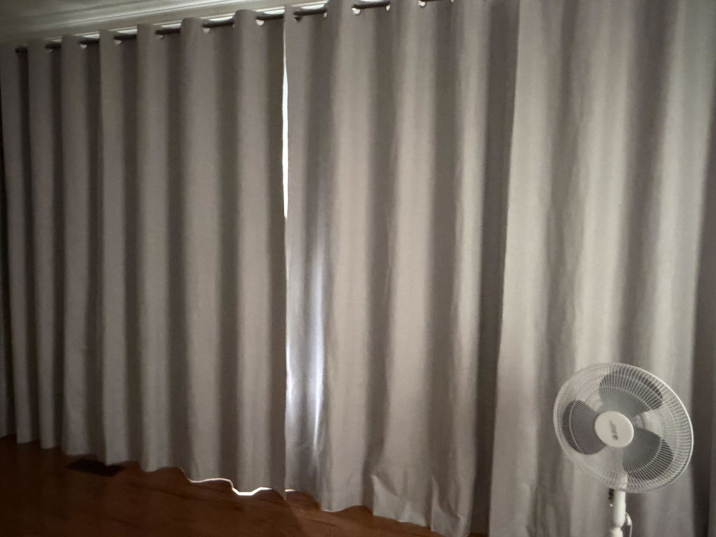
Flash forward to the late 2010s and early 2020s and, as trends go, we became sick of grey everything. Grey carpet, grey tile, grey walls, faux grey floors—it all screamed “flip house,” and we went in search of something fresher. Enter: white. It was at this time that we saw the emergence of the stark white wall. We paired that with blonde wood floors and kept going strong with black hardware. We had definitely hit our Modern Farmhouse era—farmhouse, but make it a bit more traditional and bougie.
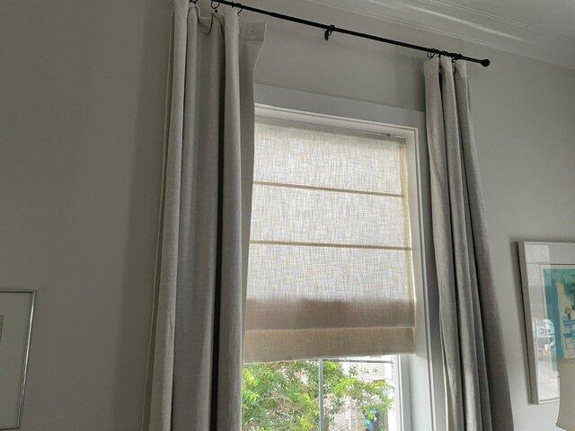
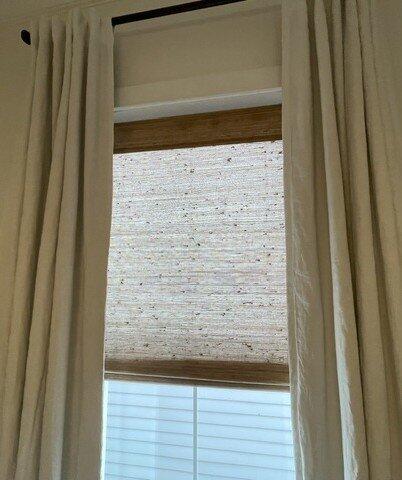
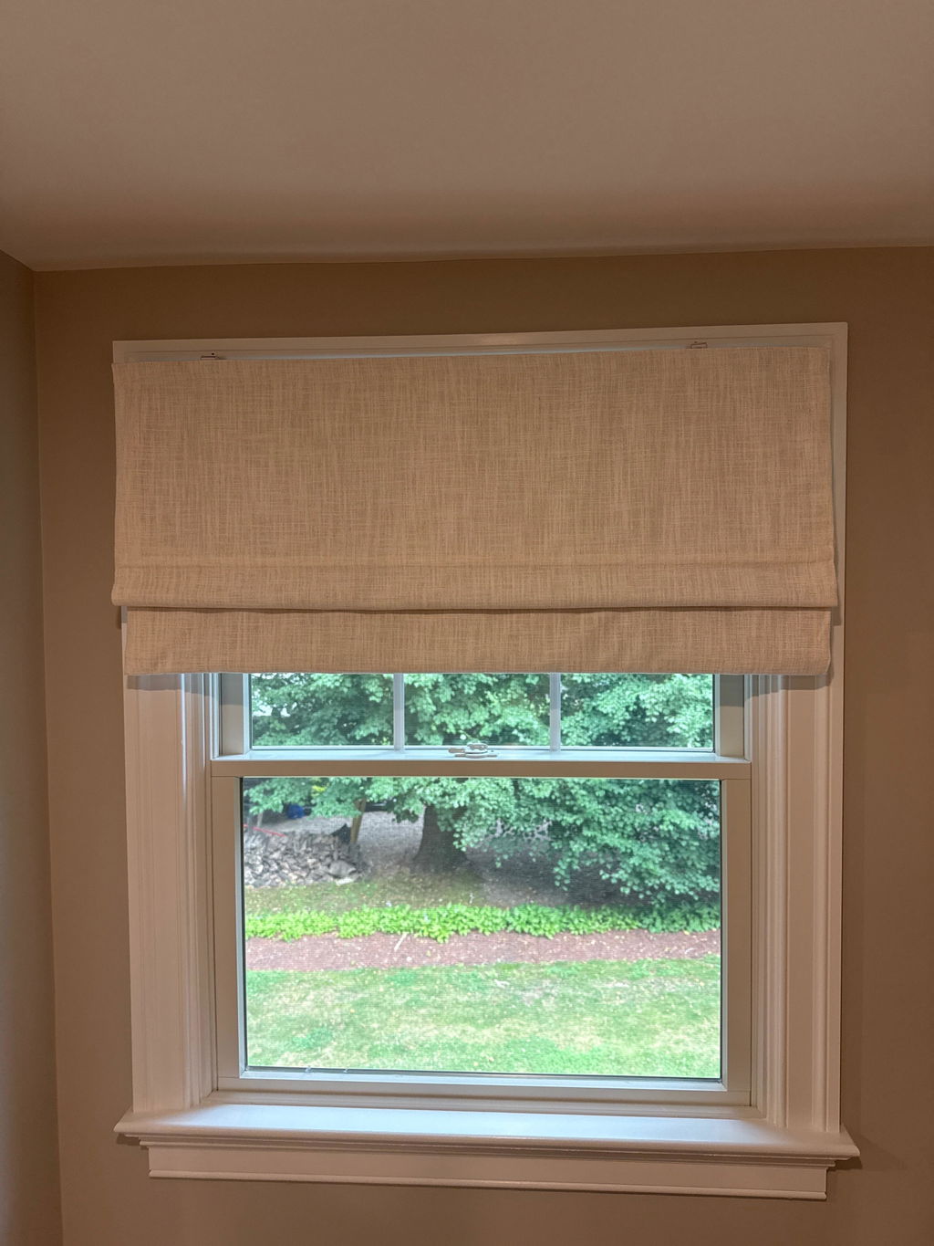
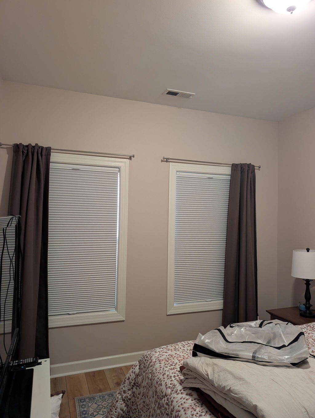
Somewhere along the way—through a mess of a pandemic and post-pandemic world—we found ourselves shifting from stark white to beige… and all shades of it. The term “sad beige” or “sad beige baby” started popping up sometime around 2022–2023, and it’s since been used to describe people so concerned with an aesthetic that style has been sacrificed for a feeling of safeness in design.
Now don’t get me wrong—I appreciate a beige. I do. As a designer, I always say every colour has its place. But our obsession with beige-washing has gone too far. What started as a desire for calm and tranquility has morphed into using beige as a design crutch—a colour to hide behind to keep ourselves safe from making too bold a decision. I’ll be the first to say as well: it’s your home, and you should do what makes you happy. But at what cost are we putting ourselves into such limited boxes?
The Cost of Playing It Safe
Social media has us twisted around in some ways—especially for those of us who spend a great deal of time on it. The natural human need to fit in is magnified tenfold when you consider the sheer amount of “perfect” homes that are thrown in our faces multiple times a day. I’m no innocent party—as a designer, it’s important to make my home as appealing and current as I can manage. After all, my home is my brand.
In every design, though, I’ve come to realize that tight colour palettes put unnecessary constraints on self-expression and creativity. After all, your home is an extension of you—it’s a culmination of everything you are, what you like, and who you love. There are things we see and things we want to feel that should translate into our homes. We have to ask ourselves: does plain design really fit this desire we have for authenticity? After all, we are not plain. I can say that for me, plain design does not fit the bill. While I’m not what you would call a “bright colour girly,” I am big on pattern, a lover of botanicals and vintage elements—and in many ways, I always have been.
Beyond Authenticity
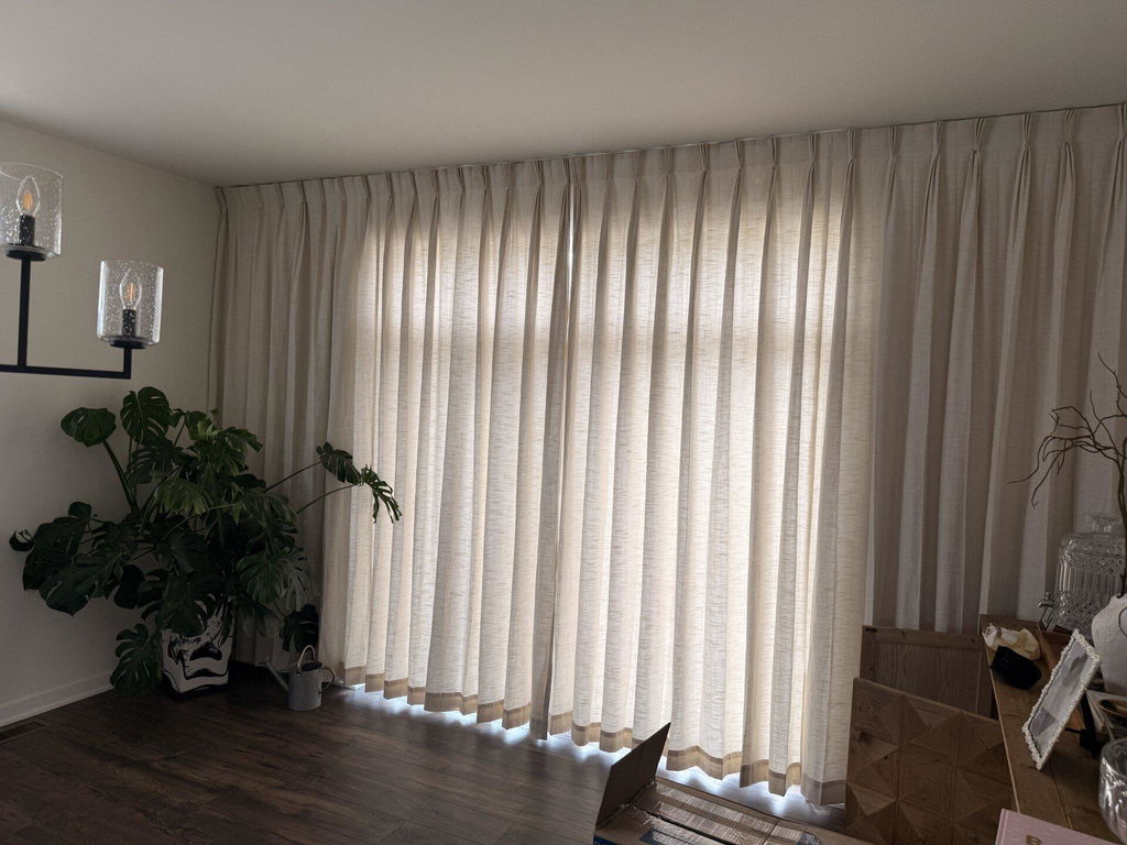
Beyond authenticity—which, let’s be real, is sometimes difficult to nail down—are the principles of interesting and dynamic spaces and design. Colour, pattern, texture, and proportion can be used to create spaces that have the calming effect we’re after while still guiding the eye around the room in a pleasing way. Use of contrast, whether in styles or colour tones, can have a very dynamic effect on the eye, making your space appear larger and more interesting—more you.
Breaking Up with Beige—Gently
Like any caring friend advising you on a breakup, I would tell you not to throw the baby out with the bathwater. We can all agree that a beige base is a beautiful thing—in fact, its application as a base colour is where it really shines. Here are some practical ways to add colour, pattern, and boldness into your space while keeping your base beige:
-
Add in accessories and decor that feel like you—pictures, pillows, shelf styling, and rugs are the perfect pieces to incorporate.
-
Choose the bold choice! If you’re worried you’ll get sick of something, ask yourself if you’re choosing it just because it “goes with everything,” or if it’s because you truly love it. Your home deserves some dopamine decor. If it’s something like a funky print or a moody colour that’s really struck you—take that as a sign of authenticity.
-
Do things in phases. You don’t need to change everything right away! A beautiful home is curated one piece at a time.

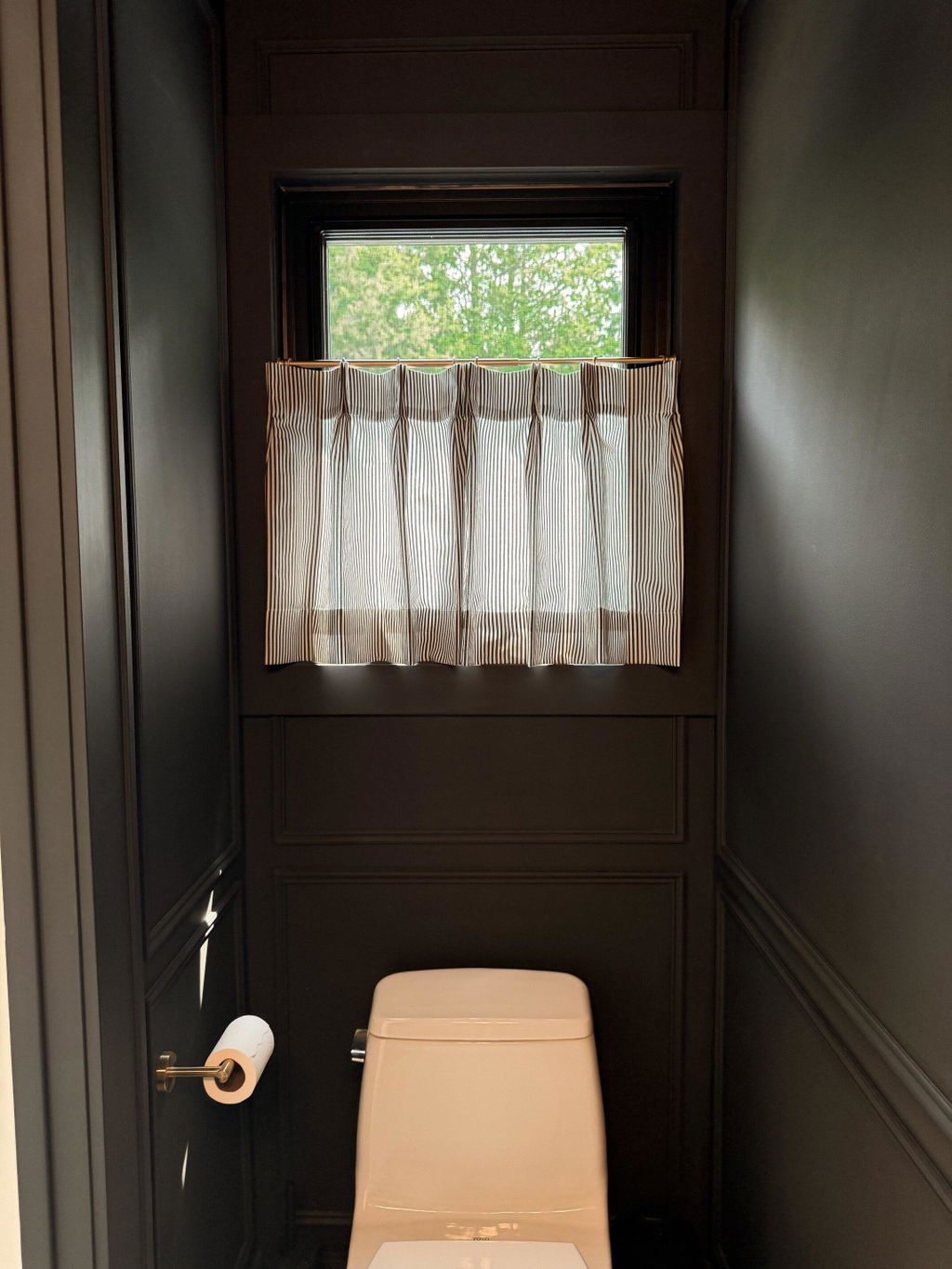
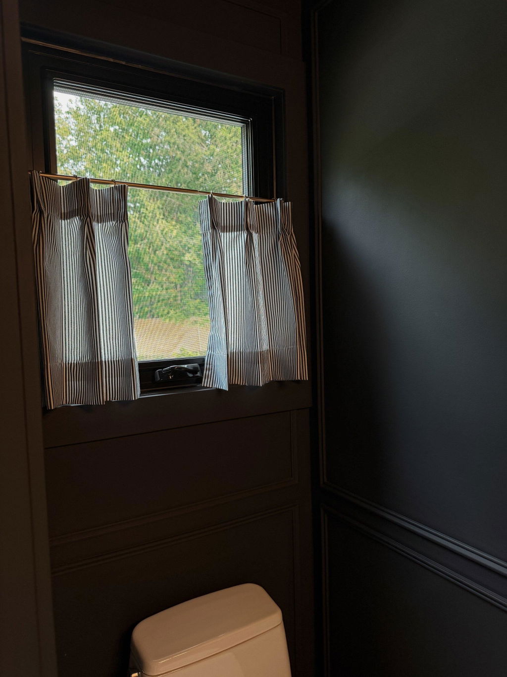
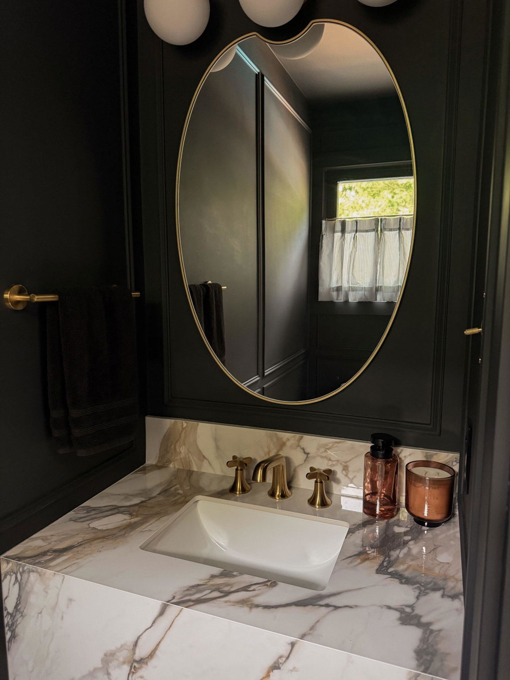
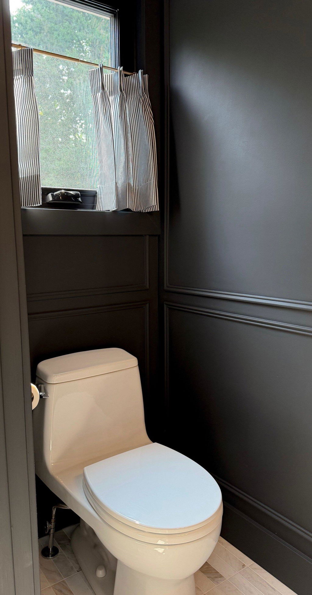
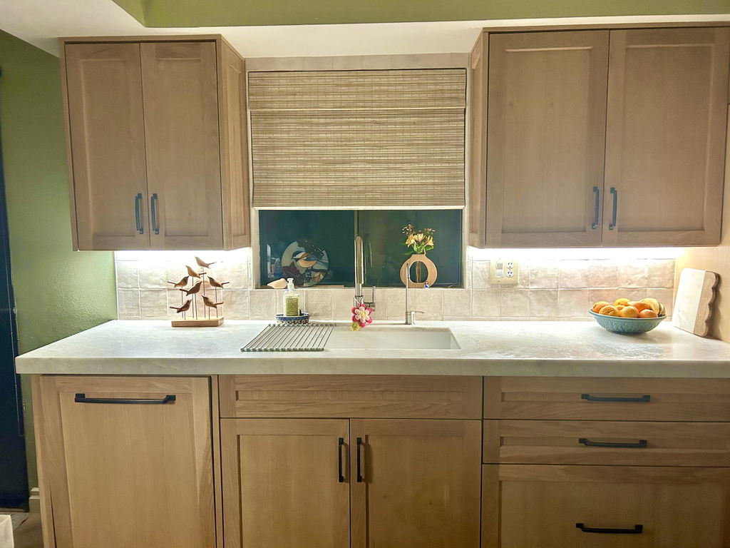
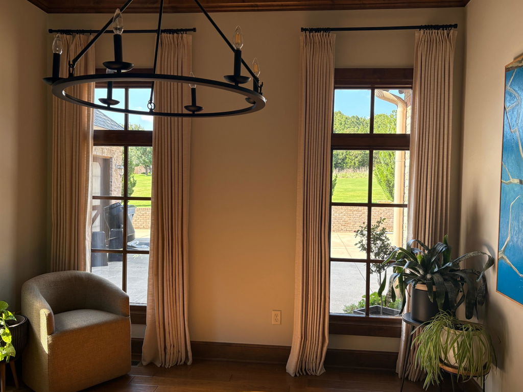
Case Study: Modern Farmhouse to Moody Family Room
-
Before: White, grey, barnwood—looking tired and very overdone
-
After: Bold, interesting, warm—more authentic, fits better with the family who lives there
Conclusion
You heard it here—neutrals have had their moment, and now is the time to be bold and decisive with your décor. The trick is to bring in things that feel meaningful: art that speaks to you, colours that make you feel good, and memories you want to be reminded of. It’s time to make your home feel like you again—in all the facets that make you, you.
*All photographs credit: Brittany McNab
ABOUT WRITER

Leave a comment