Beyond Green: Why Biophilic Design is More Than Just Plants
By Mehnaz Khan

When we hear the term biophilic design, the first thing that comes to mind is greenery—lush indoor plants, natural wood textures, and organic materials. But did you know that this is only a small part of biophilia? There’s more to it, and something that people don’t generally associate with it: COLOR.
If I’m being brutally honest, color is purely natural. Unfortunately, we live in such a frivolous world where we’re made to believe that color is merely about aesthetics—something to adorn things and make them pretty and beautiful. And that’s it. The reality is that the aesthetic aspect of color is a very small part of its influence. Color plays a crucial role in your everyday life, and by using colors consciously and intentionally in your home, you can improve your mental, emotional, and physical well-being and health.
Biophilia suggests that when humans connect to nature, they feel better, happier, and healthier. Biophilic design encourages us to bring nature into our surroundings to improve our well-being. And that’s exactly what color does. First of all, look around you and see how many colors nature has created. To realize how positively color impacts each and every one of us, think of how people look forward to spring and how happy and wonderful they feel in spring and summer. And then think of how people feel in winter, when the color palette is not only limited but grayed out. People suffer from winter blues, and everyone longs for spring.

You have that innate human attraction to color because it’s nature, and it feels alive.
The Psychology of Color and Why It Matters
Since color causes physiological changes in the human body, you can use it to your advantage to alter the way you feel and behave. While personal likes and dislikes play a role, they are shaped by life experiences. A good event or a bad event can create subconscious associations with certain colors. Of course, different cultures have unique attitudes toward color. For example, in the West, white is the color of weddings, while in the East, it signifies mourning. However, no matter the cultural context, the psychological impact of color remains constant. Whether you like a color or not, its properties remain unchanged. For instance, disliking the taste of broccoli doesn’t negate its nutritional properties. Similarly, a color’s psychological effects persist regardless of personal preference.
The simplest and most significant way to change and enhance your surroundings is by applying the principles of color psychology. Not all colors are created equal—they affect human psychology and physiology in unique ways. Each color in the visible spectrum corresponds to a different wavelength, which is why we see various colors and experience distinct effects.

Color is Not a Trend
Following yearly or even seasonal color trends or painting your walls a color simply because everyone else is doing it is a frivolous approach to decorating. It’s like saying one brand claims that “Vitamin D” is the vitamin of the year, and suddenly everyone begins to take it. That’s not how we operate. We know that we will take vitamin supplements that our bodies need, not because a friend is taking them. The only people who benefit from these trends are the paint brands and fast-fashion interior brands that release new choices every season to make more money.
Color is one of nature’s most powerful tools, and by embracing it, we create environments that not only look beautiful but also nourish our minds and bodies.
So the next time you think about designing a biophilic space, ask yourself: Are you truly embracing nature’s full spectrum?

A soft low-intensity green chose to create a tranquil and serene bedroom to unwind and relax at the end of a hectic day.
Practical Applications of Color in Your Home
Now that we know color is essential for well-being, how can you apply this knowledge to your own home? Here are some suggestions for using color in different rooms to create specific emotional outcomes:
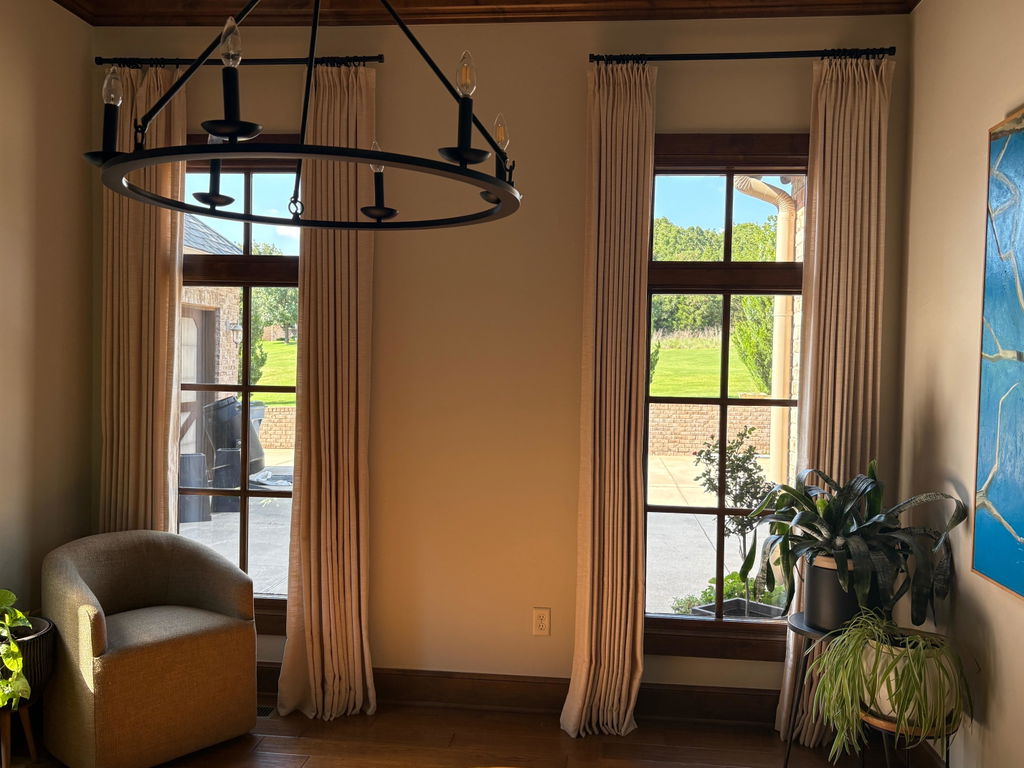
• Blue: Blue is the color of the intellect. Low-intensity blues (aka light blues) calm the troubled mind and relieve tension. Hence, it is a great color to use in rooms where you want to unwind and recharge at the end of the day.
• Yellow: This color connects to emotions, stimulating feelings. Preparing a wonderful meal is first a physical activity (the action of chopping, stirring, kneading, etc.), and then an emotional activity. Ever notice how the same recipe turns out just amazing for some people in your life? Therefore, your kitchen is a perfect place to sprinkle a little yellow.
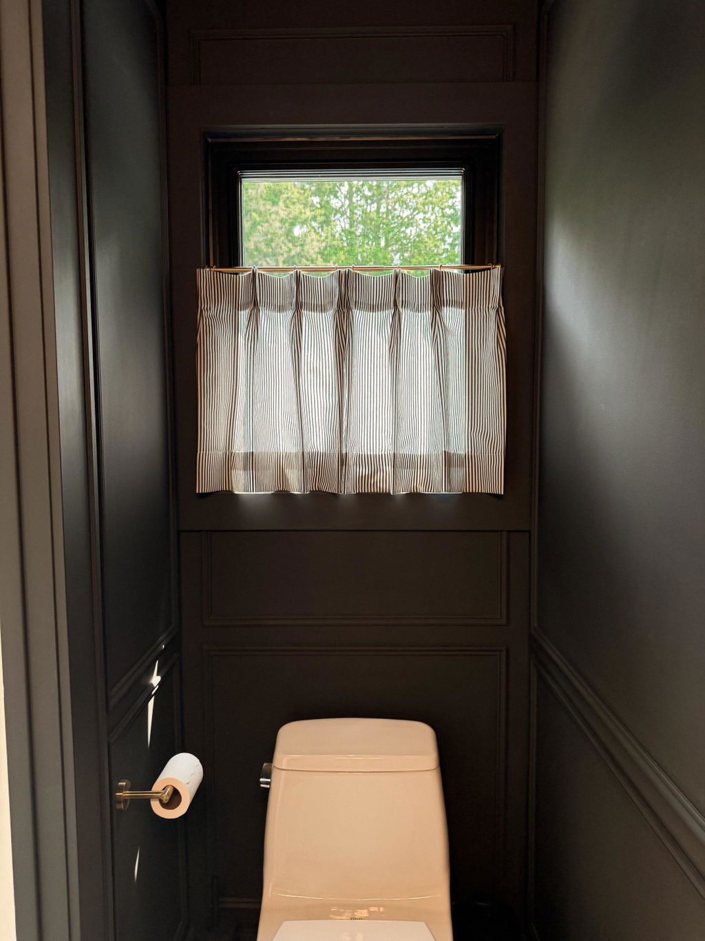
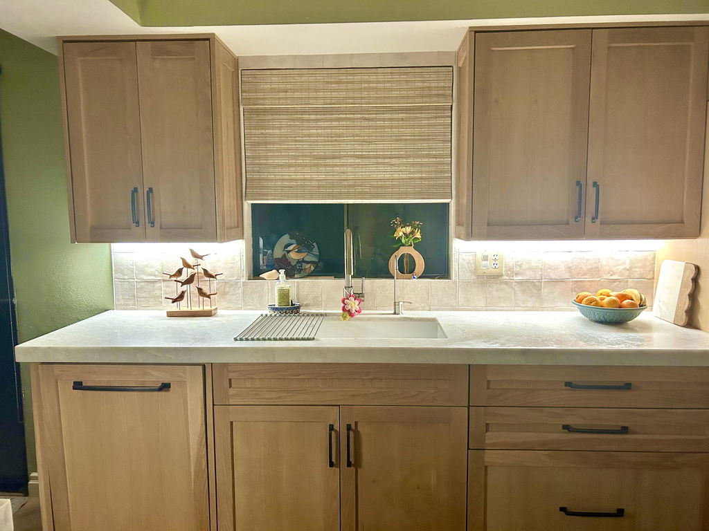
• Green: Green strikes a balance between mind, body, and emotion. Saturated greens are invigorating. Use them in your home office to paint built-ins, while low-intensity greens work well in a bedroom to create a tranquil and restorative environment.
• Red: Red is the longest wavelength of light in the visible spectrum. This color always engages the mind. Use it in spaces where you need help boosting physical activity, such as the home gym or the laundry room (keep in mind that the tasks of laundry—washing, folding, etc.—are physical activities).
• Purple: Purple is the last color we can see in the visible spectrum of light. It connects us to the higher realm. Use deep purples in spaces where you intend deep contemplation and mindfulness, such as a meditation room. Or use light purple in a bedroom for quiet, reflective time.

A home library drenched in a deep purple to encourage deep contemplation.
By incorporating these colors thoughtfully, you’ll create environments that support both your emotional needs and your connection to nature.
Follow Your Colorful Home Interiors for more on how to use color mindfully in your home.
*All photographs credit: Your Colorful Home
ABOUT WRITER


Leave a comment